
Recently Tasmania unveiled its AFL team, which to the dashed hopes of turbo chook enthusiasts everywhere turned out to be named the Tasmanian Devils.
Pretty much the obvious choice given it has been the local team's name since forever and that the AFL has been tousling with Warner for the trademark from 2019, not something done with only a fleeting interest in picking it as your Tasmanian team's name.
Done by local agency the20 and supported digitally by Neon Jungle, I'd like to first off celebrate that the team sourced locally for their creative work and that they have done a great job - the proof is in the pudding and it's clearly resonated with the local community given how many have signed up to the club already.
In truth though my initial reaction to the branding was actually quite negative which is pretty part in parcel of any branding exercise. After sitting on it for a few months I've come round on it a fair bit.
Modern AFL logos tend to come in two flavours, either "flat" or "legacy".
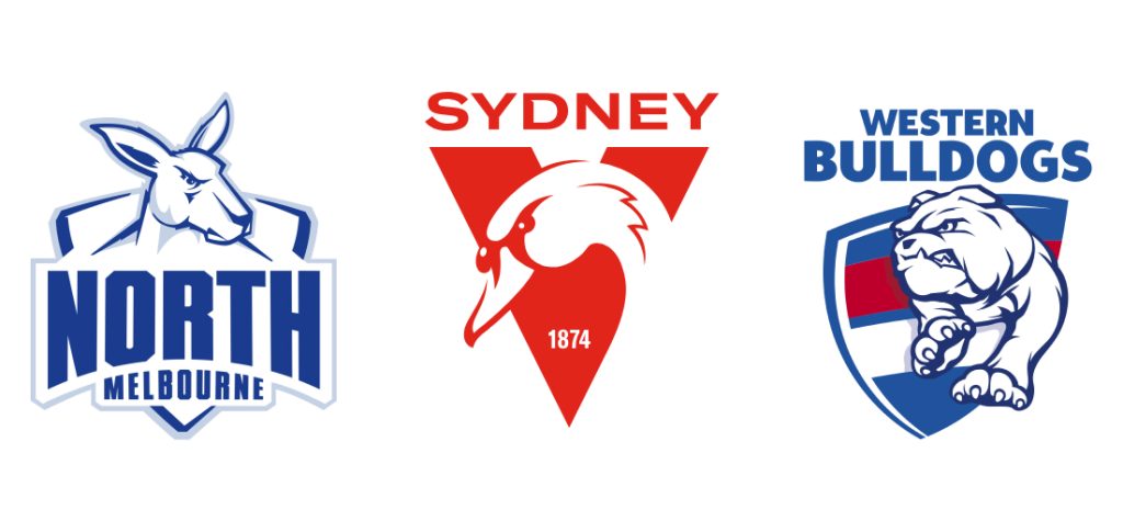
For flat logos, think the Swans, the Bulldogs, the Eagles or North Melbourne. They use one to two colours and negative space to create their logo.
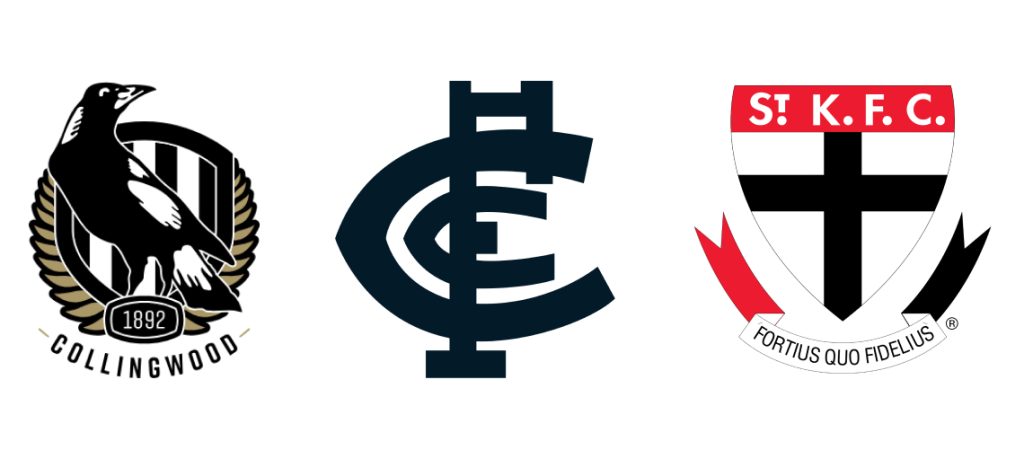
For legacy, you have teams like St Kilda, Carlton, Collingwood and Essendon. These logos are kind of complicated for the modern day, but they harken back to the early days of their respective clubs and their heraldic elements give a strong feeling of having a long history.
Personally, I tend to prefer the flat ones - they're modern, clean and their use of simple elements make it easier to integrate them into various applications and creative lockups.
The new devils logo doesn't fully fit either of these categories. It's a closer to the flat side, though it has enough small details that it doesn't feel completely ultra-glossy and modern.
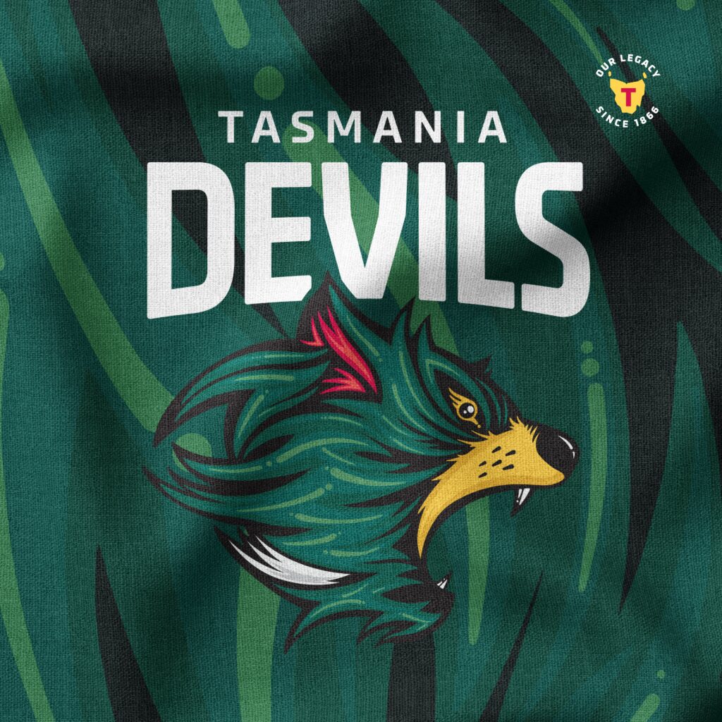
The textured background present in most applications makes all of the elements click together into something quite cohesive looking. It doesn't look anything like any of the other states and I think that's a good thing.
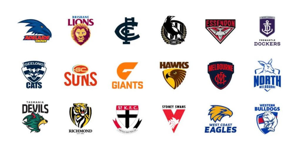
With its green palette and geometric type it stands out. It's rougher than something like the ultra glossy Eagles logo and is more modern than a St Kilda for instance. The Tassie devil illustration also gives it a bit more personality over the overly basic Giants logo as a good comparison to a new team to the roster.
Perhaps the most controversial part of the branding is the jerseys. The historic plain green jersey with a cutout of Tasmania with just a "T" which is a strong contrast with the shiny new main logo.
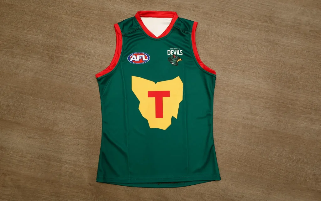
I get where the criticisms come from, but I disagree that they're not effective. The design is a good way to respect the legacy of the team and it gives a sense of "the local team going national" - it's for the existing members, not new ones.
It aims to build local support for the team and it does so successfully. Good design is about what is effective, not always what is the glossiest - a good example of that is Tropicana's rebrand in 2009 where modernising the design too much missed the mark with the existing audience.
Though, in this case I would imagine once the team is more established nationally these jerseys will likely be updated to something more modern.
Whenever you take any of the brand elements in isolation it can come across awkward, but when all put together and put into the wider context of the league the branding definitely ends up as more than the sum of its parts, which is what you want a branding to do.
It's going to be interesting to see how the club evolves it's visuals from this point, but personally I feel they have created a very solid and flexible starting point from the launch.

